Building better landing pages for international student recruitment
The following feature is adapted from the 2024 edition of ICEF Insights magazine. The digital edition of the magazine is freely available to download.
There’s a good chance you already know where a lot of your best prospects are right now. Need a hint? Many of them are online, and especially on their favourite social media and messaging channels. Those students are exploring where they want to study, and they’re following the links savvy institutions are incorporating into posts and videos.
When students click on one of those links, where do they go? In many cases, to an institutional website. This is good, but not always ideal. That’s because prospects could instead be directed to a landing page designed to:
- Answer their top questions;
- Intrigue them;
- Persuade them to take an action that leads them closer to enrolment.
What is a landing page?
A landing page is a focused webpage designed for a segment of prospective students (e.g., international students in general, students from a particularly important target country, or students interested in a specific programme).
A landing page is meant to generate the most promising leads for an educational institution. Defining a clear goal to guide the design is essential. For example, you might want students to submit an application on the page, connect with a student ambassador, or fill out a contact form to request more information.
Institutions can also create a landing page for a specific campaign. This has the benefit of allowing a school to measure the success of a marketing initiative. For example, did the Facebook campaign in West Africa drive students to take an action on an associated landing page? Did a student fair in Bangladesh result in Bangladeshi students submitting contact forms on the landing page linked to the event?
Anatomy of a good landing page
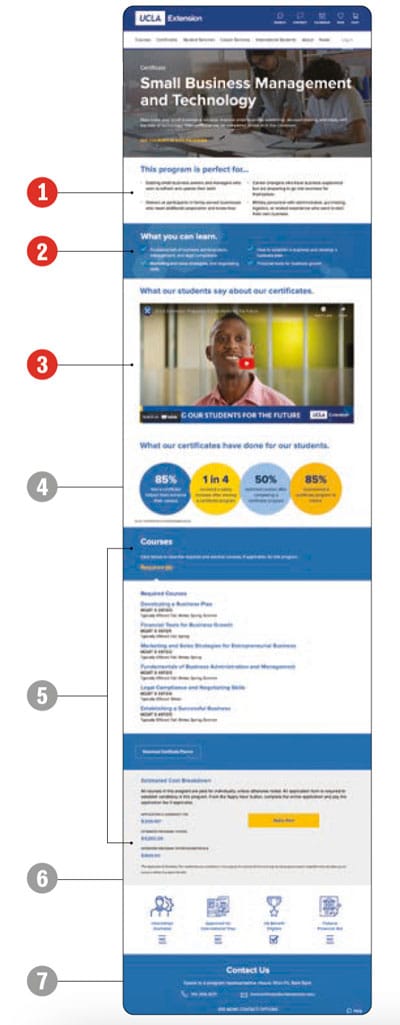
UCLA developed an effective landing page for one of its continuing education programmes: its Certificate in Small Business Management and Technology. This is an example of a landing page targeted at a segment of students interested in developing a particular skill and certification to give them a boost in their current career as a small business owner or employee.
The page designers clearly knew:
- What kinds of questions and goals target students would have;
- What kinds of students should – and importantly, should not – apply to the course;
- What calls to action (CTAs) should be on the page: "Apply Now" and "Contact Us".
1. Succinct explanation of benefits

2. Brief presentation of details

3. All-important video testimonial

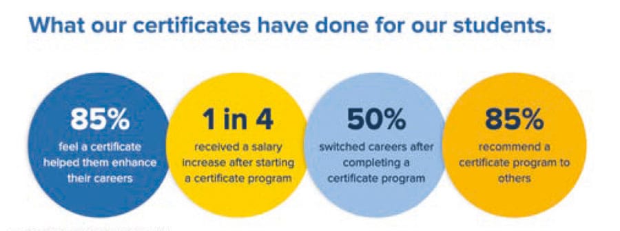
4. Proof of graduate outcomes
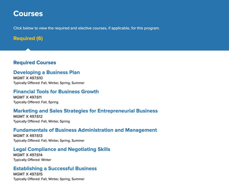
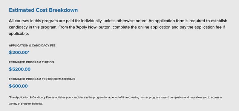
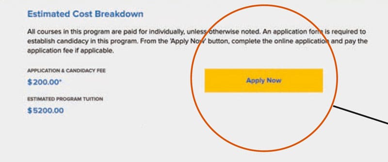
5. Info to weed out unqualified leads (e.g., if students do not have required courses or adequate funds, they will not apply)
6. Call to action: Apply Now
7. Secondary call to action: Contact Us

The link to efficiency
Students want to find the exact information they’re looking for quickly, and they want their questions answered immediately. A good landing page can serve their needs. Similarly, a well-designed landing page allows admissions staff to persuade best-fit students to press onward on the path towards enrolment.
For additional background, please see:
- Attend ICEF Digital, a unique, one-day networking conference focuses exclusively on digital and AI innovations for marketing, recruitment, and admissions professionals in international education.
- "The art of the short: Viral video for international student recruitment"
- "How good homepage design can encourage 'stealth applicants' toward enrolment"
- "The importance of SMS and messaging for converting prospective international students"


