How good homepage design can encourage “stealth applicants” toward enrolment
- Most international student prospects go to school and university websites to research whether an institution or programme is the right fit for them
- But not all institutional websites consider what stage of research students are at, and some are not appealing to a large segment of students: stealth applicants
- Developing a range of international student personas is key to addressing students at each stage of the enrolment funnel
One of the top resources for international students researching study abroad is still the institutional website, which of course means that website design should be a priority for schools, institutes, and universities. Good website design anticipates a wide range of students coming to the website for information and answers and reflects that diversity through intelligent structure and content.
Don’t forget about stealth applicants
International students will come to your site at various points in the enrolment funnel – and many of them will never make themselves known to admissions before they actually apply.
UniQuest research has found that the vast majority of international students never make contact with the university, college, or school they apply to and receive offers from, and half of these students use only the university website as an information source before applying.
These students are known as “stealth applicants.” Many stealth applicants are students whose interest in your institution isn’t so developed that they’ve followed a link to a landing page or sent in a query. Instead, they are students who might have:
- Seen your institution when checking out rankings such as those from QS or Times Higher Education (THE);
- Come to your institution through searching for “best colleges in [country]” or “best affordable university” (or any other search criteria);
- Watched a great short-form video on TikTok, Reels, or YouTube where your institution was mentioned or hashtagged; or
- Been advised to consider your institution or school by a counsellors at an education agency.
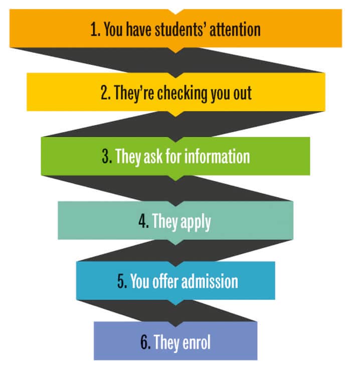
In other words, these are students who might be considered early-stage leads who are near the top of the enrolment funnel – just after the “you have their attention” stage and right before the crucial “they’re checking you out” stage.
Why your institution’s homepage banner matters so much
Often, the first image stealth applicants will have of your institution is the banner – aka “hero” – that greets them when they arrive on the homepage. This is why it’s so important to consider the composition of that hero.
Digital marketing firm Vital Design has some excellent recommendations for the homepage banner. The firm advises:
- “Use video or impactful photography showing campus life.
- Clearly tell the user what the college or programme they’re looking at offers, along with what they’re about to see as they scroll.
- Avoid abstract or “artsy” messages that don’t concretely connect with what prospective students are looking for.
- Don’t box yourself in in with CTAs (calls to action) aimed only at the bottom of the funnel, steering clear of the overused and ineffective “Apply Now.” (And, to a lesser extent, “Request Information” or “Learn More.”)
They point to the example of a banner (from Rocky Mountain College of Art and Design) that works well in terms of copy, if not imagery:
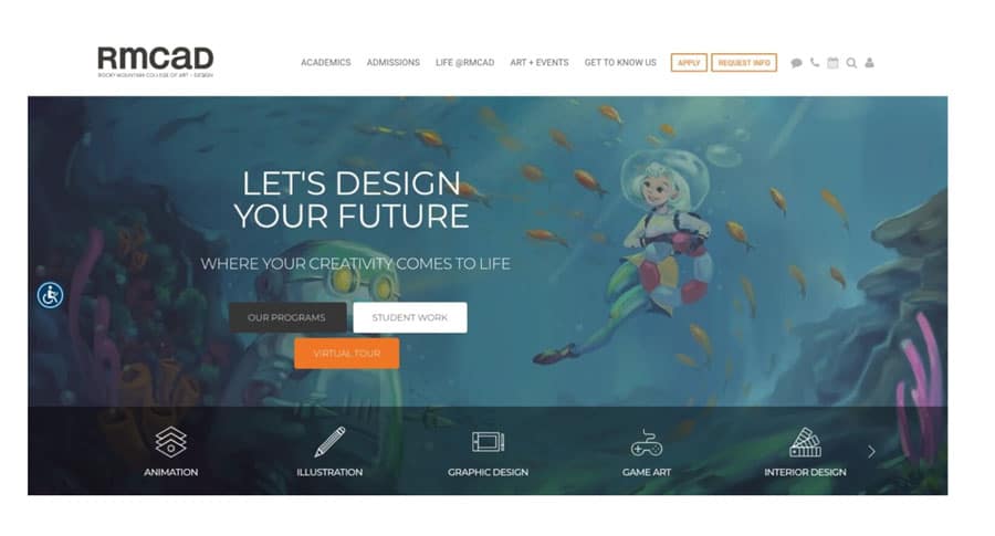
Vital Design notes:
“Rocky Mountain College of Art & Design stands out from the throng with an image of student work. The headline and supportive copy speaks directly to the aspiring student. And while the design of the CTAs is a little strange, the copy is strong: Our Programs; Student Work; and Virtual Tour. All allow prospective students pathways to explore the school further before committing.”
The firm also singles out an example of a poorly designed banner (from Pomona College):
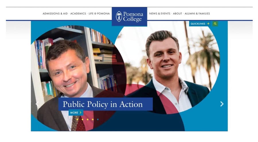
Vital Design elaborates on the issues with the Pomona college banner:
“Southern California liberal arts college Pomona chose to go with a carousel hero that highlights five different news items — each one of interest to only a tiny percentage of prospective students. In our experience at Vital, carousel heroes decrease engagement because most users don’t have the patience to let all the images scroll.”
The best
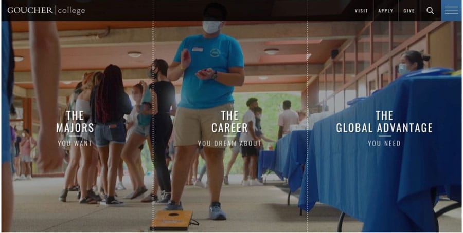
A banner Vital Design says is exemplary is Maryland-based Goucher College’s (below). The firm explains:
“The hero section of Goucher College’s homepage hits all the right notes with warm, relatable campus life videos. We’re especially impressed by their CTAs, which avoid the bottom-of-funnel traps like “Apply Now” in favor of appealing to students who are more concerned with finding the right degree programs, advancing their careers, and having a great college experience (which includes study abroad opportunities, highlighted here). Great job!"
Design should accommodate different types of international students
Along with prospects who are just becoming aware of your institution, there are a multitude of student profiles who will come to the site with questions. This underlines the importance of creating a series of student personas to guide website design, communications, and marketing campaigns. The Interactive Design Foundation defines personas as “fictional characters, which you create based upon your research in order to represent the different user types that might use your service, product, site, or brand in a similar way.”
Each persona will reflect details such as:
- The country in which students live;
- How much money students have for study abroad;
- Whether they are likely candidates for scholarships;
- Where they are in the enrolment funnel (from early interest to ready to apply);
- Whether they are interested in just one study field or considering several;
- And more.
Once you create a set of student personas, delineate logical “paths” you would like each persona to take through the website and reflect these paths in the navigational structure. You’ll want to have pages that are relevant to all international students, and also pages that appeal to niche segments (e.g., students from a particular country or region).
As the pages become more targeted, make sure you consider students’ top questions and provide straightforward answers to them. Include at least a couple of “contact” options (e.g., “speak with a student ambassador,” “speak with an admissions counsellor,” etc.) to ensure that if students don’t see the answers they are looking for, they can connect quickly with someone who does.
For additional background, please see:


