Four types of “ROI content” every college website should have
More than ever, parents and students are looking at post-secondary education as a practical investment that ought to "pay off" with tangible outcomes - like a secure job after graduation, the potential for income growth, and the knowledge needed to evolve and advance. In response to demand, a growing number of websites have emerged to help decision-makers comparison shop for colleges with the best "return on investment" (ROI). These resources look at a number of factors when evaluating schools, including:
- Total cost of college (textbooks, living expenses, room and board, etc.);
- Potential debt;
- Expected future income (based on programme of choice and projected industry demand);
- Graduate outcomes and job placement.
But schools who put "ROI content" front and centre on their own website make the task much easier for prospective students and parents to complete, without navigating away to pursue their research elsewhere. Giving decision-makers the tools they need to evaluate your institution should be the primary goal of your recruitment content strategy. Facilitating the easy discovery of key information on your website helps nurture the conversion process - while enhancing your reputation for transparency, helpfulness, and overall trustworthiness. Here are four examples of ROI content students and parents are likely to look for on your school’s website.
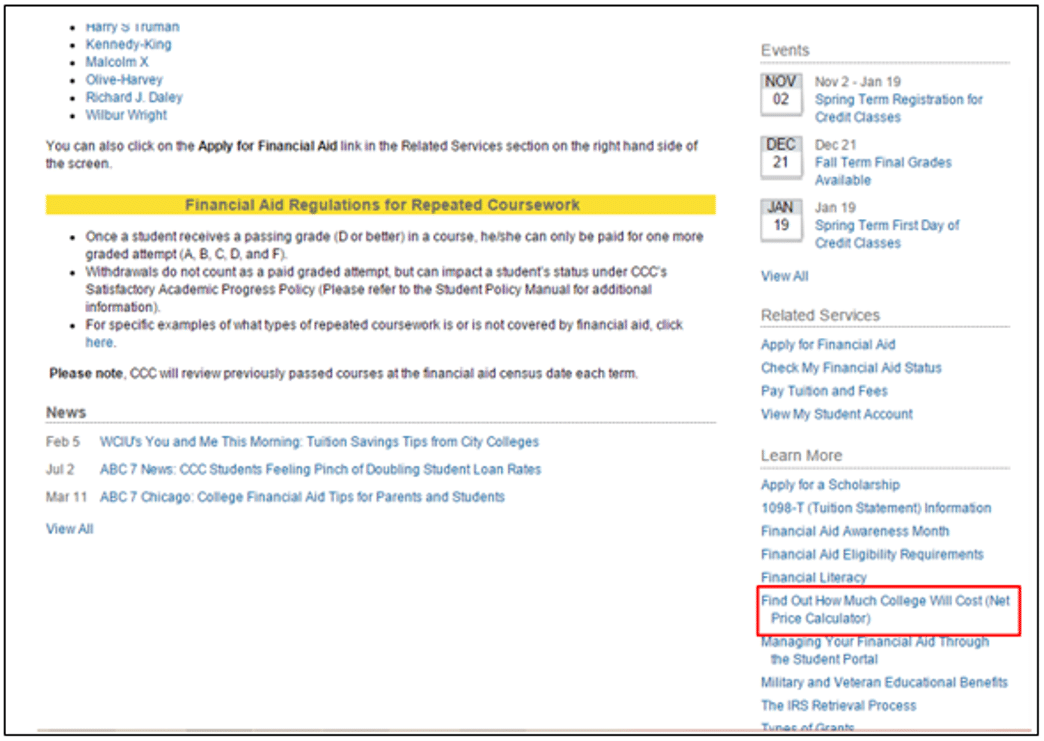
Net Cost Calculator: make it visible and easy to use
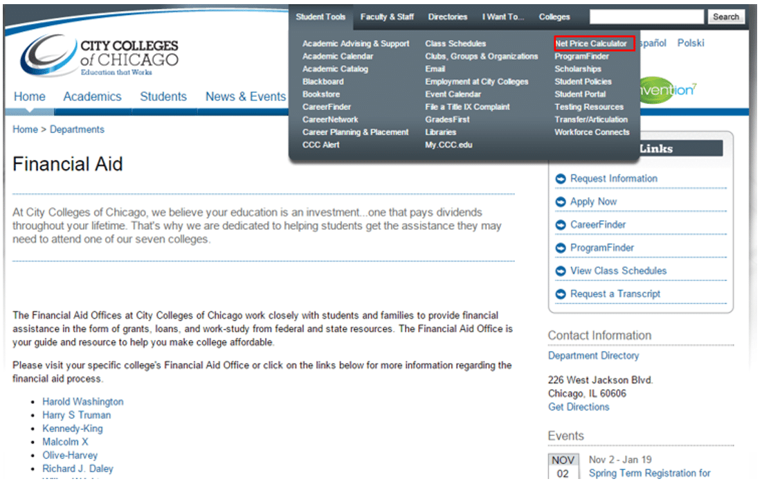
Cost Calculators can be so hard to find on school websites, that US News & World Report compiled a long list of links that lead directly to the calculators of various colleges and universities in the United States. It’s no doubt better (and more reliable) to cut right to the chase, and ensure that you have this crucial tool on your website, and that it’s easy for visitors to find and use.
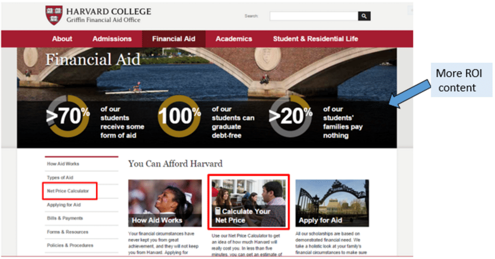
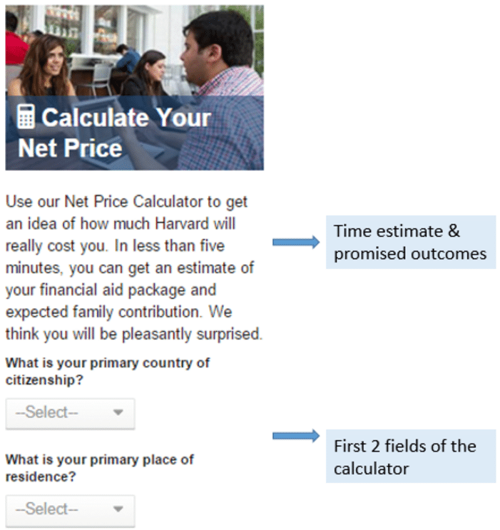
Harvard College puts the calculator right in the middle of their Financial Aid page. They also place relevant ROI content over the top banner image to help resolve the decision-maker’s concerns around affordability and eligibility for financial assistance:
Average salary and career outlook
Some career colleges do this quite well. Much of their recruitment marketing rests on the promise of effectively preparing students for in-demand, reliable jobs. Providing stats on wages and industry outlook is key to building confidence that the training investment will "pay off" after graduation.
On the other hand, even though it seems intuitive, not all career colleges and universities are making this information easy to find (or present at all) on their websites. Students are left to research salaries and industry trends on their own – which means navigating away from your domain, and relying on others (very possibly competitors) for important guidance.
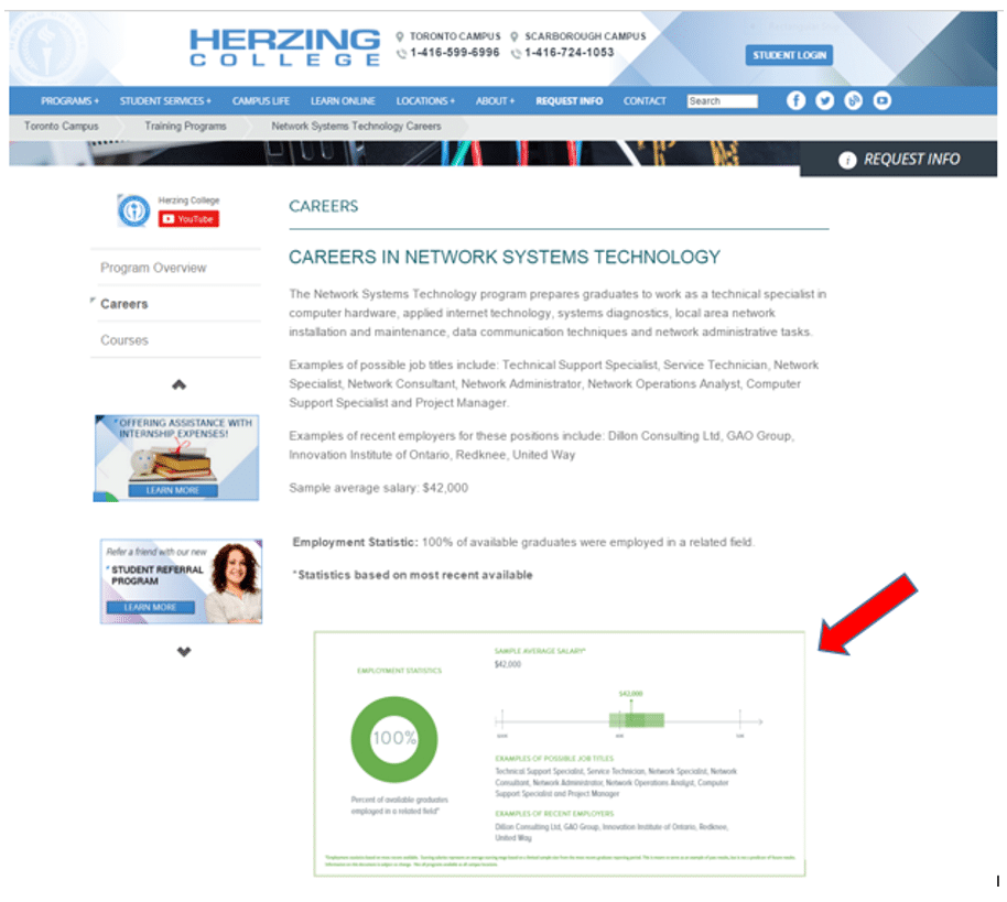
Here are a couple of career colleges who are doing a great job of highlighting ROI content in the form of average salaries and career outlooks for each of their programmes.
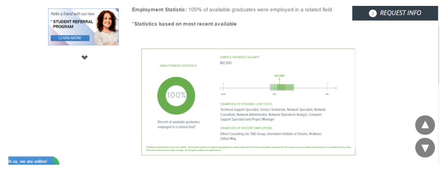
Herzing College offers a handy graphic on the “Careers” section of their programme pages (in this case, their Network Systems Technology programme):
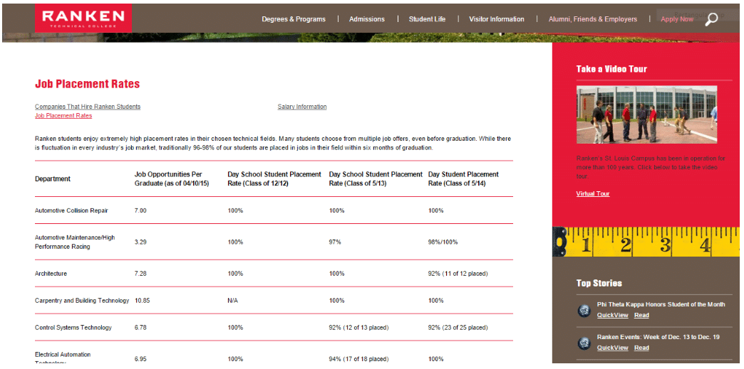
Job placement and alumni success
If you’re a university – and each of your degree programmes leads to a range of potential careers – pinning down average salaries and employment outlook might be a bit challenging.
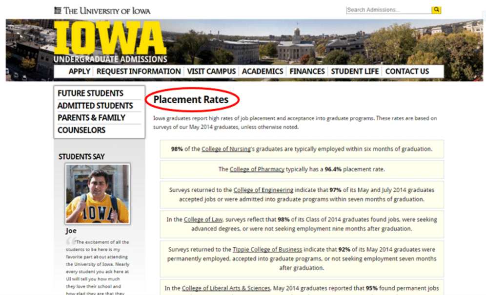
However, you could definitely survey your alumni and provide statistics on how many found work in their field after graduation. Visitors to your website want proof that their degree will lead to a rewarding job. This evidence should be prominently displayed in your academics/programmes section, to spur inquiries and prompt applications.
Here’s a strong example from the University of Iowa, which offers graduate placement statistics for each faculty in the Academics section of their website:
Show your track record
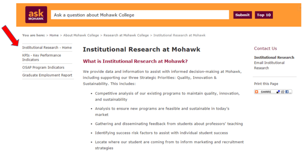
Mohawk College provides an interesting resource to website visitors who are eager to determine the effectiveness of its training programmes and learning environment. In a section called Institutional Research, Mohawk lays out its mission to offer total transparency into how it performs with regard to:
- Overall quality of programmes (by comparison with competitors);
- Quality of teaching (according to student feedback);
- Viability of training programmes in the current marketplace (according to projected demand);
- Professional success of graduates (according to the Graduate Employment Report).
Here’s a look at the section, which is located under the “About Mohawk” tab:
