

Email marketing and the power of permission
With the amount of buzz there is around social media marketing, it can be easy to underestimate the continued power of email marketing. That would be a mistake. Digital research firm eMarketer measures the ROI of email marketing at 4300%, and says it converts at a rate three times higher than social media (that is, recipients are three times more likely to respond to a request or call to action, such as a prompt to apply for admission or to connect with an admissions advisor). E-marketing consultancy StrongView conducted research among global business executives at the end of 2014 and found that email marketing ranks #1 as the marketing programme for which executives will increase investment in 2015. Recent research from Marketing Sherpa, meanwhile, shows that close to three-quarters of Americans (72%) prefer email over other communication methods used by companies. And Noel-Levitz finds a strong willingness among prospective college students to receive emails from schools they are considering. Key to reaching the potential of email marketing is building a good list of opt-ins – people who are interested enough in hearing from a brand that they provide both their email address and their permission for the marketer to email them in the future.
Driving opt-ins
The most common driver of email opt-ins is the company or institutional website, on which there is a prompt, or set of prompts, placed on the homepage and/or other landing pages for users to opt-in to receiving emails. A fascinating paper by email marketing firm Emma called "The ultimate guide to building a better email list" indicates that a well-strategised website content and layout plan can help boost email opt-in rates through the roof. The paper’s basic point is that there is very little chance a business (for example, a school) can build an impressive email list if the opt-in option is placed haphazardly, without thought, on a homepage. There is virtually no reason for the user to click on the option, because there is no sense of what the benefit to doing so would be, and every possibility that such a decision would merely entail more emails in their already overloaded inboxes.
Instead, email opt-ins need to be highly visible and difficult to not click on. It should be easy for the user to quickly understand the benefits of deciding to opt-in – to see what they would get by opting in, and to decide that the drawback of one more regular email in their inboxes is outweighed by the benefits of receiving that email.
The paper’s recommendations can be summarised like this:
- Create good content.
- Tie the best content into email opt-in prompts (e.g., a pop-up box that occurs a third of the way down a premium article asking users to opt-in, or linked to a popular video).
- Consider the quantity of content placed on a homepage or landing page – do not put so many content options for users that they skip right past the opt-in prompt.
- Include opt-in prompts that may be slightly intrusive but not so intrusive that they are annoying for the user (a tricky balance, but one that can be achieved).
- Conduct testing (especially “heat map” testing) to see if your email opt-in prompts are working and to indicate areas that need changing.
Beyond the homepage
As much as a homepage is a logical place to position a normal opt-in prompt (say, the one we routinely see in website sidebars), contextualising the prompt – linking it to a benefit – is often more effective at driving desired user behaviour. This can be done via a “gateway” page – a page specifically designed to drive opt-ins.
The gateway page (which may or may not be a homepage) contains one piece of premium content, described in exciting copy that makes the user really want to have it – and it requires users to provide their emails in order to read it or download it. The following image shows a gateway page from the web analytics firm KISSmetrics, where to get a useful report, users need to fill out the form on the left of the page.
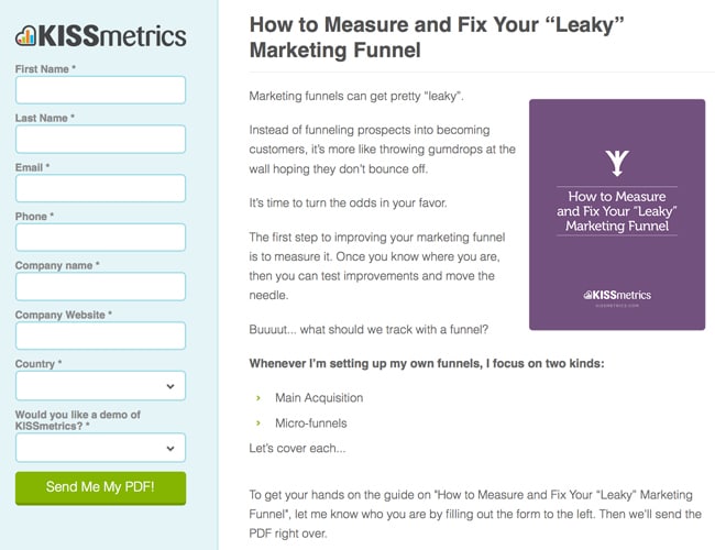
Great content that would help me in my work = this company, and emails from this company.
It is an elegant, even polite, way of asking users for their emails, because it offers an exchange: you give me your email; I give you excellent information. Also important about the KISSmetrics example is the simplicity of the gateway page: one piece of in-demand content, one email opt-in prompt. Emma notes that too much content can get in the way of a business’s ultimate goal. If your top business goal is to increase your email list, then plan your content to reach that goal.
Populating a page with all sorts of different content might look dynamic, but if it doesn’t drive the behaviour you are looking for, it isn’t working.
Building the gateway
Copyblogger provides a quick summary of what every gateway page must have in order to boost email opt-ins:
- “The headline: You’ve got to instantly catch attention with your headline.
- The benefits: You’ve got to tell by teasing, usually with fascinating bullet points.
- The call to action: You’ve got to expressly tell people to sign-up.
- The opt-in form: You’ve got to have a way for them to sign-up.”
When it comes to wording the call to action, there are far more interesting ways to ask users to provide their email than just, “Sign up.” For example: “Enjoy a free, one-on-one chat with an international student advisor when you register here!” Gateway pages must present a clear reason for users to want to opt in. The incentive could be content (e.g., a free pre-departure guide or a members-only video), a discount, or something else of value to the user.
The right amount of intrusion
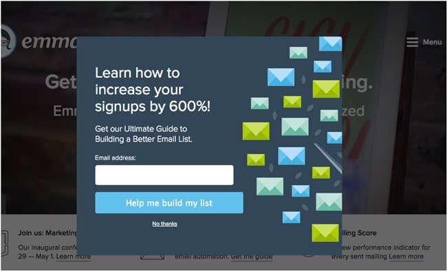
Anyone who has had a “light-box” or “pop-up” interrupt us when we are doing something we really want to be doing on a website knows that feeling of being annoyed. But how annoyed? This is the big question when it comes to pop-up boxes. Of course users would rather not see something suddenly appear to distract them from their goal (say, reading an article), or even obscure the object of their attention. But, if the content is really good – if they really want to get back to it – they will not be so annoyed that it causes them to leave the website (and many people are now so used to the pop-up convention that it doesn’t bother them at all). And, they may just opt in (the whole point!). Emma offers these possibilities for effective pop-ups:
- Have the content go dark once a pop-up appears so the pop-up request is exceptionally clear. See below for an example from Emma’s own site.
- Have the opt-in form appear only once the reader has read a certain amount of content (for example, half of an article), so they have a good sense of the quality of what they are reading.
- Have the opt-in form appear five seconds after the reader has landed on the content, again, so they get oriented in the content they want to read.
Homepage prompts
Even when a business has an excellent gateway page, it should retain a standard, relatively boring (yet unobtrusive) opt-in link on its homepage because some users may be more likely to opt-in this way than via a gateway page and/or pop-up. Different kinds of users have different kinds of behaviours, after all.
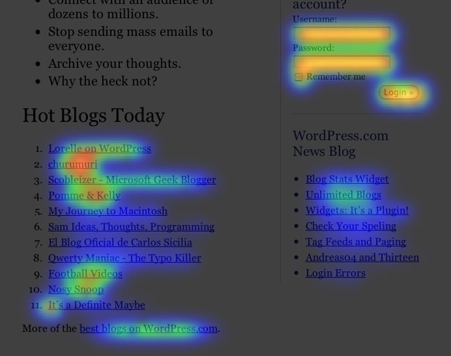
To increase the chances a standard opt-in link will grab users’ attention, Emma recommends using a “heat map.” Such a map identifies “hot” and “cold” areas of a page; if your opt-in prompt is not in a hot area, it should be moved.
Mobile is different
With so many students accessing the Internet via mobile phones, it is important to have an opt-in strategy for mobile as well. Emma recommends having only one or two fields in the opt-in form (e.g., name and email) so students won’t be bothered with too much typing. While less is more on mobile, it also applies in general: the shorter an opt-in form, with as few fields as possible, the more likely people will type in their information.
Integrating social media
One way of growing an email list is to provide an option for recipients to share the email’s content on their social media channels. For them to want to do this, the email content has got to be good and something they want to be associated with. Good content will also make it much less likely they will not search for the dreaded “unsubscribe” link.
Once you have ensured you have created a great email template, include social icons in it. Social Media Examiner captured the following image from a Huffington Post email, using it as an example of good practice because the icons are bold and very prominent in their placement:

Building opt-ins is one thing, keeping them another
One of the quickest ways to offend potential customers is to lure them into providing their emails only to bombard them with messages of little or no value. Not only will they unsubscribe from the emails, they may also abandon any relationship with the brand. Creating excellent email content is essential to keeping an email list strong, but it is not easy. eMarketer just reported on a January 2015 survey that found that 67% of polled marketers said that email list growth was very important to their marketing programmes, and 44% considered “content relevance and value” as the top obstacles to this goal. Another survey found that marketers are increasingly focused on what happens once they get the email opt-ins they are looking for:
“Here, just 21% of marketers worldwide looked at list growth rate to measure email marketing success. Clickthrough rate (47%), conversion rate (43%) and click-to-open rate (38%) were at the top of the list, and unsubscribe rate was even more important, at 23%.”
The basic rule of thumb for keeping subscribers … subscribed … is to create content that gives them something: information they need, discounts they will find attractive, etc. A common mistake is to push products and services subscribers do not need or care about. Another is to drone on and on – it’s important to keep emails as short as possible, with snappy headlines and great content. Other don’ts:
- Sending emails too frequently;
- Sending emails irregularly;
- Including broken or faulty hyperlinks;
- If personalising the email (which is a growing trend), spelling a contact’s name incorrectly;
- Using long or boring subject lines.
A big “do”? In every email, include a new reason for subscribers to stay. This could be an upcoming content “teaser,” a discount or early-bird special, or a contest or draw for a great prize.
Own the relationship
We noted earlier that email drives key business conversions (e.g., applying for admission) to a much greater extent than other channels, notably social media. This may be because of the higher degree of engagement or permission that an email opt-in represents for many users. It may also be the opportunity that email affords to share substantial, high-quality content with prospects. But another factor is that you have a more direct relationship with the prospect via email. They have given you permission to communicate with them, and email gives you a means to do so efficiently and effectively.