Boosting international student enrolments with better landing pages
- International student recruitment campaigns should direct prospects to web landing pages
- Landing pages serve a very different function than a homepage and are designed purely for conversion through the enrolment funnel – the more customised to the student segment or market, the better
- There are landing page solutions for institutions with sizeable budgets and staff and also ones that cost less – a moderate budget does not have to prevent an institution from building better landing pages for international students
Do you have a web landing page designed specifically for international students? Or even a web page devoted to one priority market? If not, it’s time to allocate resources to the incredible potential of this type of page – which has a very different purpose than the institutional homepage.
Landing page provider Unbounce defines a landing page as “a standalone web page, created specifically for a marketing or advertising campaign … It’s where a visitor ‘lands’ after they click on a link in an email, or ads from Google, Bing, YouTube, Facebook, Instagram, Twitter, or similar places on the web.” Unbounce calls the landing page “the best option for increasing the conversion rates of your marketing campaigns and lowering your cost of acquiring a lead or sale.”
Whereas the homepage is designed for exploration and oriented to all potential audiences – say all prospective domestic and international students or stakeholders looking for any program and all types of information – the landing page is all about conversion and is often focused on a specific segment of your audience (say, Vietnamese prospects or even, more granularly, Vietnamese prospects most likely to enrol in a fashion design course).
As Unbounce says, “Exploration = distraction.” The last thing you want is for the students you’ve tried so hard to direct to your landing page to get there and feel confused. That’s why simplicity – of design and of messaging – is of the essence.
The landing page speaks directly to your specific audience and answers their most pressing questions – and it always includes a call to action, or possibly two (examples include “Apply now, “Request information,” “Chat with one of our admissions staff”). Any more than two can dilute the potential for converting prospects along the channel you want them to follow. For good advice on how to design calls to action that leap out on a landing page and promote clicks, see this post from Wishpond.
A great way to get leads
A landing page should include a strategy for encouraging students to opt in for email follow-ups (and/or for other text, chat, or social channels). As Forbes magazine noted last year, “Email marketing still promises to deliver the highest ROI of all marketing channels—$42 back for every dollar you spend.”
The landing page that Unbounce designed for Athabasca University (below) shows how such a request for email can be structured to allow students to plug in vital information that Athabasca can then use to personalise their email communications. On top of that, when students submit the form, Athabasca staff receive crucial information such as when students are hoping to start a programme – knowledge that has never been more important than during all the deferral activity created by COVID.

Integrating marketing around your landing page
The success of a landing page is in large part determined by the overall campaign you create to get your audience to it. For example, if you design a page for Vietnamese prospects, you will have:
- Alerted your authorised agents to the existence of the page;
- Targeted social media ads to Vietnamese students including the link to the page;
- Included the link in all other marketing materials used in-market.
Those simple, integrated steps will bring prospect traffic to your page where it can then be channelled into key calls to action.
Why a good landing page matters so much
Landing pages are important for any business, but they are especially relevant when the goal is to convert international prospects. This is because international students and their families want to see that a school understands their needs, respects their language, and will be a welcoming place to study. A homepage whose only nod to international students is a navigation tab labelled “International” has much less conversion power than a landing page full of – using the Vietnamese example again – elements such as the following:
- Information on international student fees and scholarship opportunities;
- Visa application details;
- English language and academic requirements;
- Testimonials from other Vietnamese students;
- Information translated into Vietnamese;
- A FAQs section for parents;
- Pre-departure and arrival information;
- COVID safety protocols.
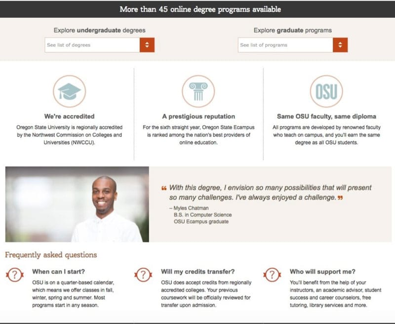
Graphic elements and visual cues are a great idea for landing pages, as they keep the page clean and clutter-free and focus on key information. This partial screenshot of a landing page designed by Instapage for Oregon State University shows how well graphics can convey high-priority content.

A landing strategy in action
The University of Brighton applies different levels of customisation according to tiers of priority markets – they’ve obviously done their homework on what students from each market are looking for in terms of information. For example, compare their landing pages for Thailand, Canada, China, and Botswana. It’s clear from the varying approaches to each country page that the university wants to encourage talented applicants from all countries, but that some higher priority targets call for higher levels of customisation.
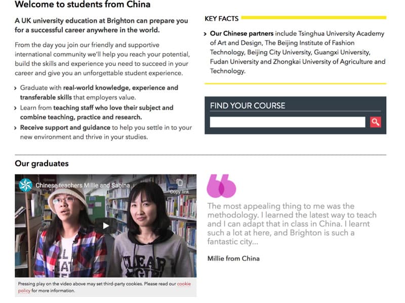
In the screen cap below, you’ll see part of Brighton’s landing page for Chinese students, including a video testimonial – always a powerful element.

Customise where you can
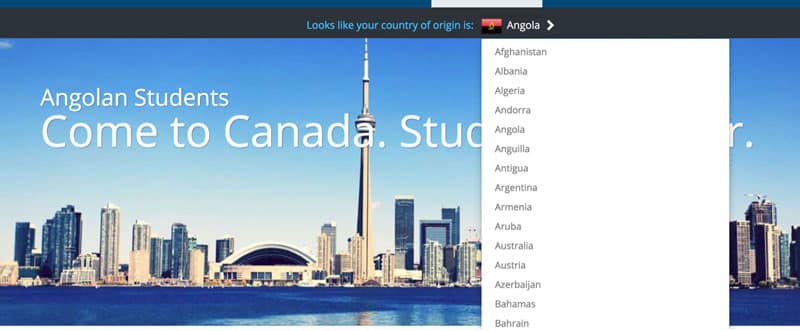
Canada’s Humber College has created a standard landing page designed for all international students, but thanks to a handy device, they can make the page look customised for dozens of different nationalities – see the two images below. When students click on their country of origin, the banner chances to reflect their nationality, so the “Angolan students” pictured below changes to “Colombian students,” “Nigerian students,” or any other nationality in the list.
You will also notice some variation from page-to-page with priority markets – such as China – showing further targeted messaging and additional features, such as student testimonials.

The level of customisation is relatively minimal across many of these markets, but the device is still a worthwhile investment. For example, it would allow Humber to send agents in each target market a link to a landing page that is more tailored for their students.
Not sure how to get started?
Not all schools will have the digital expertise necessary to build effective landing pages. Luckily, there are all sorts of third-party companies that can help. Landingpages.com has a great post reviewing the pros and cons of 17 leading landing page builders, including price points for each. There are many more outside of this list available as well.
Don't forget A/B testing
Many of the services Landingpages.com lists include A/B testing, allowing clients to test out different versions of their landing pages to see which is generating the most conversions. This ability to experiment is a great feature geared at maximising ROI. Digital services company VWO summarises the advantages of A/B testing in the following graphic.

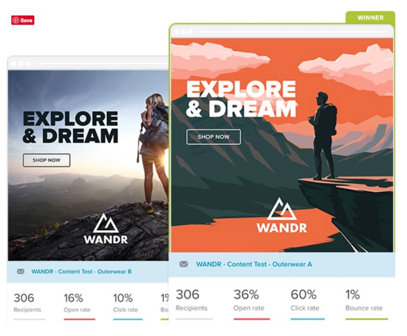
Another example, from the email platform Emma, shows how much more effective their client’s landing page B (in orange on the right) was compared to landing page A.

For additional background, please see:


