


Visually led: The growing power of image-first design in international student marketing
- Today’s college-age students are characterised by shrinking attention spans and by higher levels of engagement around visual content
- As a result, international student recruiters need to give greater priority than ever to strong images and video content, and to carefully structuring key information or prospective students
What do Millennials and Generation Z students – the primary audiences for most international student recruiters – look for on websites? First and foremost, they want a strong visual presentation that conveys confidence. Colour. Minimal copy.
Teens and 20-somethings have grown up digital, and that means (1) they are highly familiar with good web design, and (2) they have zero patience for websites that make them read when they don’t want to. Design company Killer Visual Strategies sums it up like this:
“The average human attention span was eight seconds in 2017, down 33% from 2000. Why are attention spans dropping so fast? Whereas Millennials earned the fame of using three screens at a time, that’s nothing for Gen Z, who…juggle five screens simultaneously on average. This makes appealing visual content, which can reach their brains 60,000 times faster than text, is all the more important for reaching this generation.”
Even when they know students’ user behaviours on websites, higher education marketing teams can face a conundrum when they try to accommodate them in website design. Schools and universities have multiple audiences to serve, different study levels, dozens of programmes, and reams of information to communicate in order to answer international students’ many questions.
As a result, it is very common to see institutional website homepages characterised by content overload. It’s almost as if the strategy was to pack as many different categories of information onto the page as possible in the hope that at least some of it will “stick” for any student visiting the site. By trying to do too much, these homepages fail to make a crucial, positive first impression.
The good news is that increasingly, we are seeing examples of international educator and associated destination marketing websites that avoid the trap of overly busy homepages. They are simple (and beautiful), and they are actually highly sophisticated in terms of their function within the website as a whole. Their only goals are to be visually stunning and to make it easy for visitors to move throughout the site to find the information they need.
What does a good homepage look like now?
According to HubSpot Marketing, the components of an effective homepage are “an image that tells a story but isn’t too distracting, use of white space, easy nav bar, a tagline or slogan, and a clear [call to action]…a clean design that’s free of any distractions and invites visitors to learn more about the brand.”
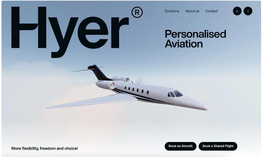
One of HubSpot’s favourite examples (outside of higher education but illustrative nonetheless) is of Hyer Aviation, shown in the screen shot below but better viewed by visiting Hyer’s site where you can see the airplane slowly moving across the screen. It looks impressive but doesn’t distract the visitor from moving on to cues linking through to other pages on the site. And it includes two calls-to-action to move visitors quickly towards conversion (e.g., “Book a Shared Flight”).
Within the higher education industry, these are some examples of homepages that keep it simple, visual, and functional – and that are highly effective as a result.
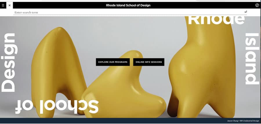
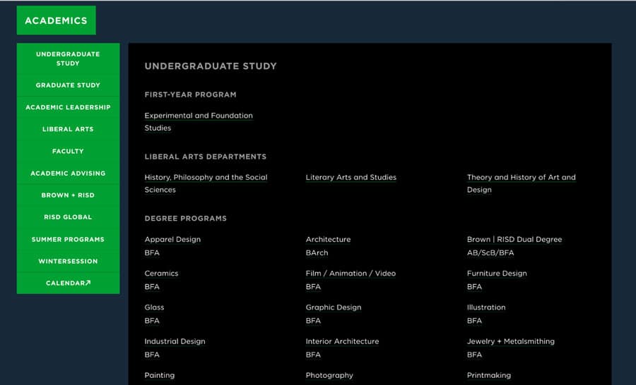
Rhode School of Design
The first screenshot shows an “above the fold” image (one of a couple in a rotating carousel) for Rhode Island School of Design. The image is of a student’s own work, and it is not only visually stunning, but meaningful and strategic. More image panels follow below the fold for interested visitors, but they do not compete with the main image or with the information architecture.
The next screenshot shows where the design school hid all its copy: right where it’s supposed to be, on a secondary page. Referring back to the first screenshot, when a visitor clicks on “Explore Our Programs” they come to the following information-loaded page.
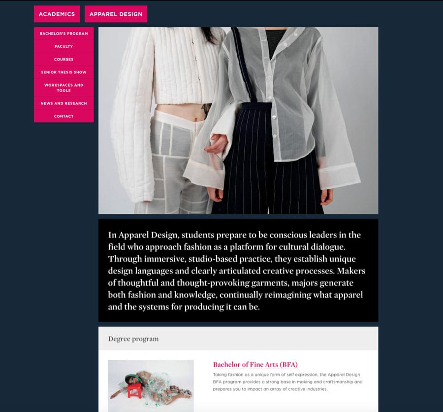
Once a visitor clicks on one of the links on the programme listing page, they are brought to a third-level page where images once again are the dominant element but supported by concise copy.
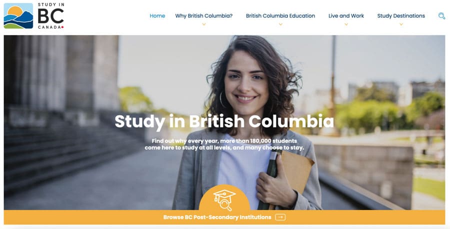
Study in BC
The homepage for Canadian destination marketing initiative Study in BC is highly visual and strategic. British Columbia is one of the most popular regions in Canada for international students, but many students who choose BC are concentrated in and around Vancouver in BC’s Lower Mainland. As we’ll see, the homepage is designed to make students aware of other regions in the province.
The page opens with a simple visual block and well-considered copy that highlights immigration as well as study opportunities. The visual could be brighter but it is friendly and unencumbered by too much text.
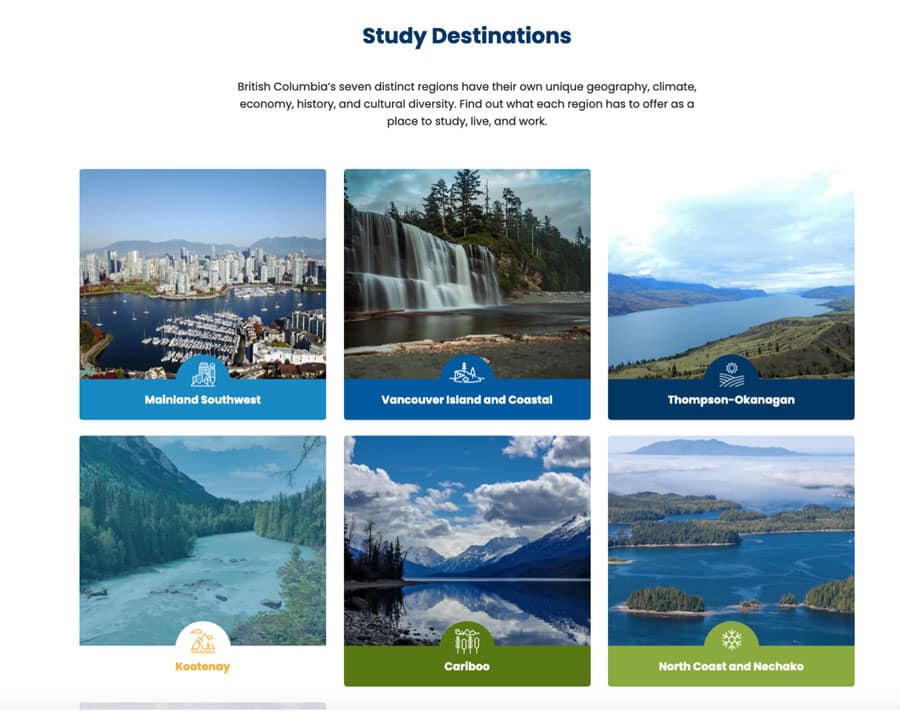
Further down, the page presents top value propositions, information links, and a prominent “Study Destinations” cue.
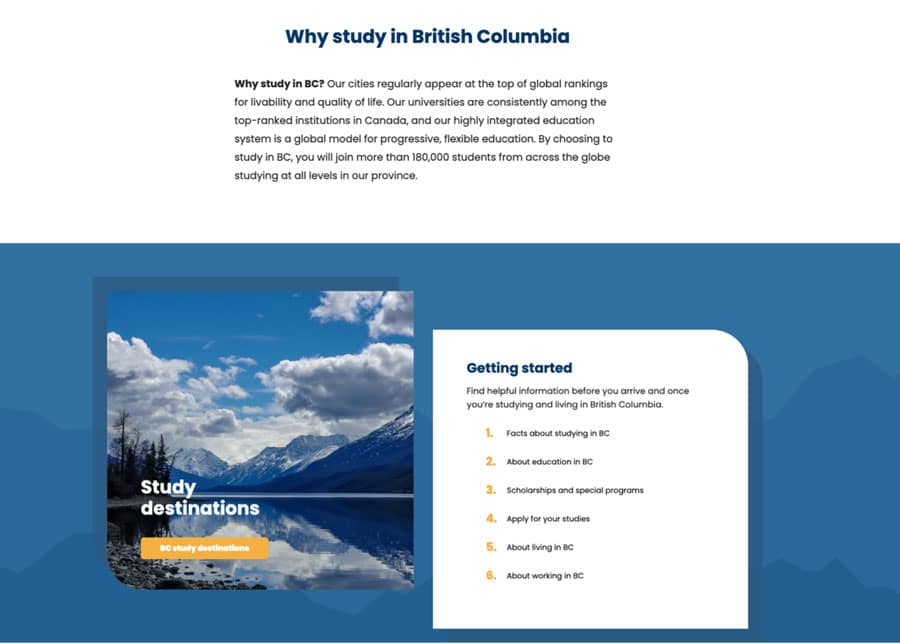
Clicking on “Study Destinations” brings students to a page where they can explore the advantages of each region – each of the square panels leads to another highly visual, nature-based presentation.
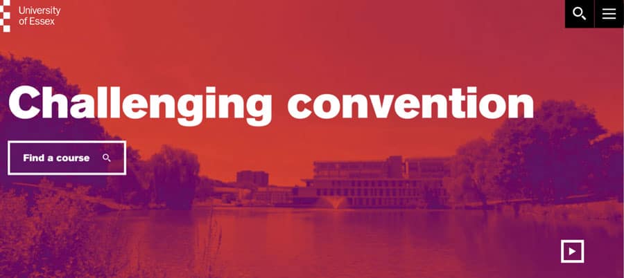
University of Essex
Highly ranked University of Essex has a homepage that exudes confidence. Colour and bold assertions fill the top section of the page, which has a “play” button that turns the visual into a fully fledged video (trust us, it’s worth watching).
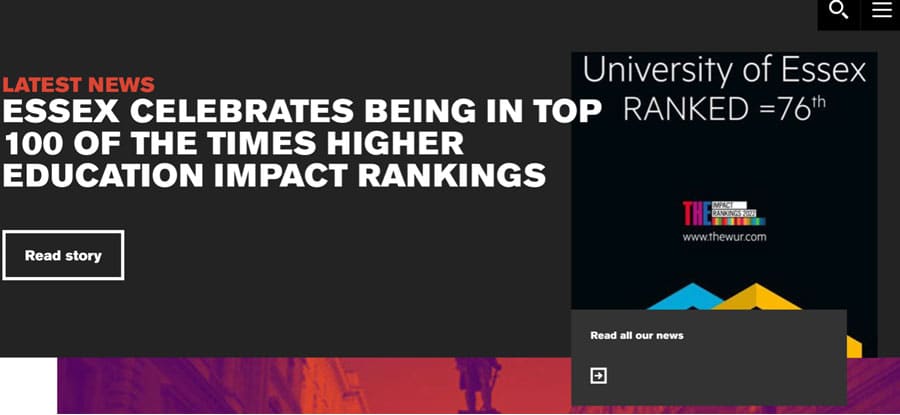
Further down on the homepage, visitors can quickly see why the university is so prestigious. Again, note the very spare copy.
You can still tell your story without cluttering your homepage
If you explore further through the three sites we’ve highlighted today, you’ll see some effective strategies revealed for structuring information and engaging prospective students. Our example sites pace out key information on secondary pages and then blocks of short copy – almost always anchored by a great image. They aren’t constrained by prioritising visuals over copy on the homepage – but rather freed up to tell their story in small bites that stand a much better chance of resonating with the digital natives international student recruiters are trying to reach.
For additional background please see: