Is your email mobile enough?
People like to say that email is still the “killer app” when it comes to reaching and engaging prospects. And they’re right. Certainly this is true in international student recruitment, where, even as social channels have come to play a larger role over the last several years, email remains the students’ preferred mode for communications from prospective institutions and schools. And email has been consistently shown to convert at a higher level than other communications channels, including social.
The implication for recruiters is clear: if you have permission to email a prospect – and you are able to do so in an effective and engaging way – then you are well on your way to building a very efficient recruitment channel as well.
And even though email is now a fact of daily life for most of us, it continues to shift and evolve as do the practices for using it effectively in any marketing effort.
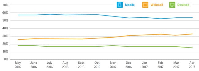
The very means by which people read email is perhaps the best contemporary example of such a shift. Over the past several years, there has been a distinct swing in user behaviour toward reading email on mobile devices.
This of course varies somewhat from country to country but various tracking studies, including one notably large-scale effort from email deliverability specialists Return Path, consistently find that mobile’s global share of email opens has now passed above 50%.

Getting ready for mobile
One of the persistent challenges in email marketing is making sure that your email campaigns look and perform great on the ever-expanding field of mobile, webmail, and desktop clients. The pursuit of the perfect email campaign is equal parts art and science but when it comes to optimising your outbound email for mobile, there are a few reliable guidelines to keep in mind. 1. Keep it simple Hold this idea in mind especially when it comes to images. Image-heavy messages will be slow to load on mobile devices, and “slow” often tracks closely with “poorly performing” in the very impatient context of email marketing. Counter this by reducing image file sizes as much as possible. Ensure that all images you place in your template are optimised for web, and as small as possible without degrading presentation quality. Most image editing tools will allow you to do this easily, and there are free services online, such as TinyPNG, that can make a remarkable difference when it comes to file size. Similarly, avoid complex layouts that cannot adjust well to different screen sizes. Build your template around a single column of content. Readers are used to scrolling, especially on mobile devices and will not be bothered if they have to scroll down a page a bit to follow great content. 2. More finger than mouse Don’t rely on text links that users might normally click with a mouse if on a desktop or laptop computer, and never crowd a bunch of small links together. Think “buttons” for your key conversions and calls to action and make them big enough that somebody can easily hit them on a touchscreen on the first try. If you are incorporating images, think about a single image (or small number of images) that can also function as buttons or strong calls to action that a user can easily trigger with the touch of a finger. 3. Make it responsive Build your emails in templates that are responsive – that is, that can detect and adapt to whatever size screen your email recipient is using. When it comes to mobile, most emails will be opened on Apple iOS or Android devices and there are lots of good testing tools out there to allow you to preview (and adjust, and adjust again) your email templates to ensure that they will look and behave the way you want across all types of devices and email clients. Test early, test often, and check your templates and campaigns regularly to ensure optimum performance. 4. Stay on message Make sure your key messages are in view at the top of your message, including in the “from” field, the subject line, and the first lines of message text. Remember that many mobile devices will only display the first 30 characters (give or take) of the subject line. So if you can’t get the point across in those visible characters, other elements on the screen, such as the “From” label, take on added significance. Once you get past those top-of-screen items, break the rest of your message text up into small, easy-to-read bits. Avoid long paragraphs and make sure that your most important points appear first. People are used to scrolling, as we noted earlier, but that doesn’t mean that they will be willing to scroll through a long preamble in order to get the information that is most relevant to them. For additional background on getting ready for mobile, please see:


